Admin UI
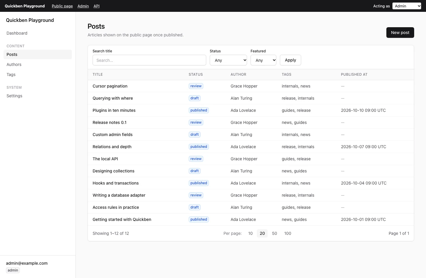
@quickben/admin renders an admin UI from your config: a dashboard, list views and create and edit forms. Pages are React Server Components. Writes go through one server function.
pnpm add @quickben/admin @quickben/nextSetup
Two files:
import { createAdminPage, handleAdminRequest } from "@quickben/admin";

import config from "../../../quickben.config";

import type { AdminRequest } from "@quickben/admin";

async function serverFunction(request: AdminRequest) {
  "use server";
  return handleAdminRequest(config, request);
}

export default createAdminPage(config, { serverFunction });import "@quickben/admin/styles.css";
import type { ReactNode } from "react";
export default function AdminLayout({ children }: Readonly<{ children: ReactNode }>) {
return children;
}Why the page file defines serverFunction
Saves, deletes and relation searches call serverFunction. Next.js runs a server function by loading the module that defines it.
serverFunction | Module Next.js loads | After a restart or on a new serverless instance |
|---|---|---|
| Defined in your page file | Your page file, with config | Works. |
| Omitted | A module inside @quickben/admin | The config is unknown until the page renders once. A form submitted from an open tab fails with “Reload the page”. |
createAdminPage(config) without options works in development. Pass serverFunction in production.
handleAdminRequest checks the shape of the request and runs it through the local API as the current user. Access rules and hooks apply.
Routes
| Path | View |
|---|---|
/admin | Dashboard: readable collections with counts, grouped like the sidebar. |
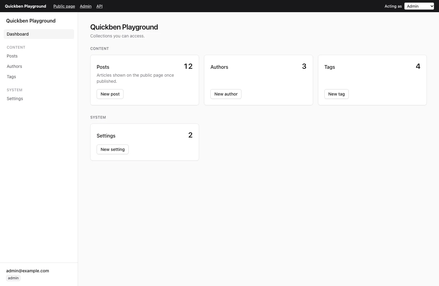
/admin/:collection | List: columns, search, filters, sort, pagination. |
/admin/:collection/new | Create form. |
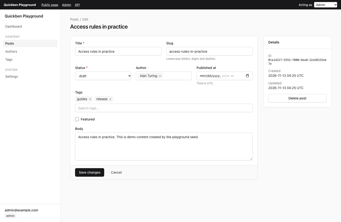
/admin/:collection/:id | Edit form, details, delete. |
/admin/:page/... | Custom pages. |
| User can | Admin shows |
|---|---|
| Read a collection | Sidebar entry, dashboard card, list and edit views. |
| Not update | Read-only forms. |
| Create / delete | “New” button / “Delete” button. |
| Nothing (anonymous) | A link to signInHref, when set. |
The user comes from config.auth on every request.
List view
| Feature | Source | URL |
|---|---|---|
| Columns | admin.defaultColumns, else the title field and the next three simple fields. | |
| Search | contains on admin.useAsTitle when it is a text field. | ?q=ada |
| Filters | Visible select and boolean fields. | ?filter.status=draft |
| Sort | Click a column header. | ?sort=-title |
| Pagination | 10, 20, 50 or 100 per page. | ?page=2&limit=50 |
Relation columns show the title of the related document.
Forms
| Field type | Input |
|---|---|
| text, email, url | <input> of that type, with length limits |
| textarea | <textarea> |
| number | <input type="number">, step 1 for integers |
| boolean | Checkbox |
| date / datetime | date / datetime-local input (UTC) |
select / select many | <select> / checkbox group |
relation / relation many | Search box with keyboard support, chips for many |
| json | Textarea with live syntax check and Format button |
| Field option | Effect |
|---|---|
label | Label text. |
description | Hint text under the input. |
admin.hidden | Not rendered, not sent. |
admin.readOnly | Shown disabled, not sent. |
admin.width | full, half or third of the row. |
admin.component | Name of a custom component. |
Validation errors from the local API are shown next to their field. The first invalid field gets focus.
Config the admin reads
| Option | Where | Effect |
|---|---|---|
admin.title | defineConfig | Title in the sidebar and dashboard. |
labels | defineCollection | Singular and plural names. |
admin.useAsTitle | defineCollection | Document title, search field, relation labels. |
admin.defaultColumns | defineCollection | List columns. |
admin.description | defineCollection | Text under the list title. |
admin.group | defineCollection | Sidebar group. Default “Collections”. |
admin.hidden | defineCollection | Hide from the sidebar and dashboard. |
modules | plugins | Sidebar groups. See modules. |
createAdminPage options
| Option | Default | Purpose |
|---|---|---|
serverFunction | built-in | Server function for saves, deletes and relation searches. |
basePath | /admin | URL path of the admin route. |
signInHref | none | Link shown to anonymous users who cannot read anything. |
components | {} | Custom field components by name. |
views | {} | Replace the list or edit view of a collection, by slug. |
pages | [] | Custom pages inside the admin shell. |
nav | [] | Extra sidebar links. |
extensions | [] | { components, views, pages, nav } from plugins. Applied first. |
Extensions
import { createAdminPage, handleAdminRequest } from "@quickben/admin";

import config from "../../../quickben.config";
import { ColorInput } from "./color-input";
import { PostBoard } from "./post-board";
import { Reports } from "./reports";

import type { AdminRequest } from "@quickben/admin";

async function serverFunction(request: AdminRequest) {
  "use server";
  return handleAdminRequest(config, request);
}

export default createAdminPage(config, {
  serverFunction,
  components: { color: ColorInput },
  views: { posts: { list: PostBoard } },
  pages: [{ path: "reports", label: "Reports", component: Reports }],
  nav: [{ label: "Docs", href: "https://quickben.vialabs.net", group: "Help" }],
  signInHref: "/sign-in",
});| Option | Component props |
|---|---|
components | FieldComponentProps: field, name, id, value, required, disabled, describedBy |
views | ViewProps: collection, user, basePath, searchParams, id? |
pages | PageProps: user, basePath, segments, searchParams |
Props are plain data, so components can be server or client components.
Custom field components
A field picks a component with admin: { component: "color" }. The component renders form controls named name. The admin reads their values like the built-in input of that field type: a string for text, JSON text for json.
color: f.text({ admin: { component: "color" } }),import type { FieldComponentProps } from "@quickben/admin";
export function ColorInput({
name,
id,
value,
required,
disabled,
describedBy,
}: FieldComponentProps) {
return (
<input
type="color"
name={name}
id={id}
defaultValue={typeof value === "string" ? value : "#000000"}
required={required}
disabled={disabled}
aria-describedby={describedBy}
/>
);
}Custom views and pages
import type { ViewProps } from "@quickben/admin";

export function PostBoard({ collection, basePath }: ViewProps) {
  return <a href={`${basePath}/${collection.slug}/new`}>New {collection.labels.singular}</a>;
}import { Card, CardBody, CardHeader } from "@quickben/admin/ui";
import type { PageProps } from "@quickben/admin";
export function Reports({ user, segments }: PageProps) {
return (
<Card>
<CardHeader title="Reports" description={`Signed in as ${user?.email ?? "anonymous"}`} />
<CardBody>Path: /{segments.join("/")}</CardBody>
</Card>
);
}pages[].path is the first URL segment: lowercase letters, digits and -. It must not be a collection slug.
Sidebar order
- Modules: their
nav, or their collections. - Other collections, by
admin.group. - Custom pages, by
group(default “Pages”). navlinks.
Styles
@quickben/admin/styles.css is built with Tailwind CSS v4. Import it once, in app/admin/layout.tsx. You do not need Tailwind in your app.
| Rule | Effect |
|---|---|
qb: prefix | Admin utilities do not clash with your own Tailwind classes. |
--qb-* variables | Theme variables do not clash with yours. |
| No global reset | Base styles apply only inside .qb-root, the element around the admin. |
| Tailwind v4 in your app | Works with no change. Your @source does not need to scan this package. |
The admin styles are in CSS cascade layers. Unlayered CSS in your app wins over them. A global reset such as * { margin: 0; padding: 0 } outside a layer removes the admin’s spacing. Put such rules in @layer base { … }.
@quickben/admin/ui exports the component kit: Button, ButtonLink, Input, Textarea, Select, Checkbox, Label, Card, CardHeader, CardBody, Badge, Table, Toast. Use it in custom components to match the admin.
Limits
| Limit | Effect |
|---|---|
Document id new | Cannot be opened. /admin/:collection/new is the create form. |
| Datetimes | Edited in UTC. |
| Cache Components | Not supported yet. next build fails on the admin page. |
Page <title> | Not set by the admin. Set metadata in app/admin/layout.tsx. |